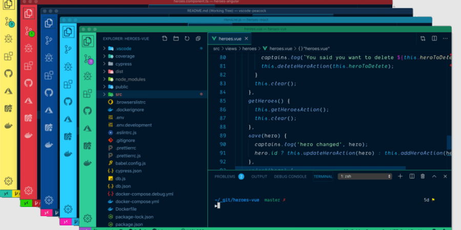
I have been working on a project that requires me to interact with upwards of 10 separate repositories at once, typically referencing a handful of them and while actively making changes and commits across three of them. A lot of my time is eaten up with switching between windows in an attempt to find the one open repo I need at any given time. VS Code is amazing, but this is a real productivity sucking pain point.
I initially tried to find out if there was a way to have all my windows present within a single window as searchable tabs (a-la Google Chrome). While there are some third party tools for exactly this, there was nothing native to VS Code. I lean towards “simple is better.”
The more I thought about it, the more I realized that the windows management via the Windows 10 Explorer taskbar (that thing at the bottom of all our screens) almost fit the bill… there were just two problems…
The first issue I had was with VS Code
The VS Code title bar defaults to showing the name of the currently open FILE in your repository first. I am working with terraform and I have 10 different repositories with file names like “main.tf” and “locals.tf” – so the file name means absolutely nothing to me when it comes to differentiating all these windows. In short, this sucks as default behavior… When you click on the icon in your Windows 10 taskbar, all you can typically see are those file names for each window title (the rest gets cut off).
Thankfully there is a really easy fix for this with VS Code using the settings.json file. Once done, VS code shows me the name of the repository in the title bar first, followed by the file name. Here is how to go about it if you would like to do the same:
This sets the VS Code window bar name to show the name of the repository first, instead of the currently opened file name. This is like 75% of the battle and was life altering and brain healing. I highly recommend it if you are working with 3 or more repositories at the same time.
The second issue I had was with Windows 10
“Aero Peek” was a really cool looking feature when it was released. It’s the nifty looking thumbnail preview you get of a running application when you hover over the icon in the taskbar. Looks nice… however it is a step backwards (at least for this use case) when it comes to productivity. Folks that used Windows XP remember when this same hover action used to just cause a list of windows to show. Now that my VS Code windows titles all actually have some distinguishing meaning, having them in a vertical compact list is desirable vs. a GUI thumbnail preview. Thankfully, with a very small registry edit you can achieve exactly this.
You can follow the instructions here to modify your registry (I was able to add/modify the referenced key without local admin privileges). If you are relatively familiar with making registry changes, here is the summary:
Open this key:
Add a new “DWORD (32-bit) value” and name it this:
Double-click it and set the “Value data” to:
Finally, open up Task Manager and restart the explorer.exe app.
This will refresh the Windows explorer interface with your new registry setting.
Conclusion
Once you have made all of the above changes you can actually find things by just hovering over the VScode icon in your task bar and get a nice usable list of workspaces. This little hack has really improved my life so I felt I just had to share. Cheers!
References:
https://www.addictivetips.com/windows-tips/replace-taskbar-previews-list-view-on-windows-10/
https://stackoverflow.com/questions/38483687/showing-project-folder-in-title-bar-for-visual-studio-code/41174218
Editing VSCode settings.json file

